|
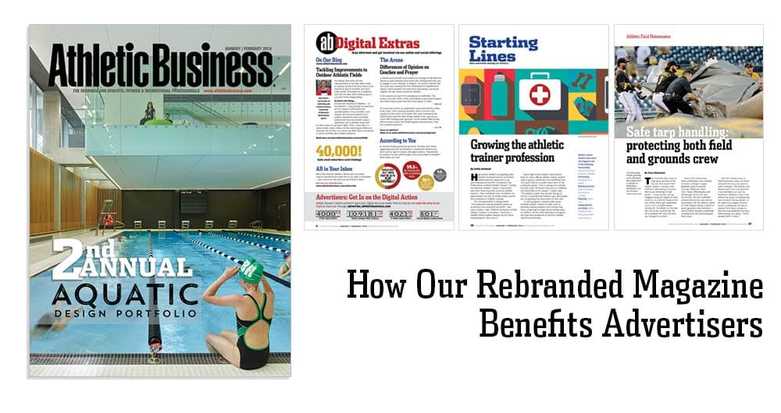
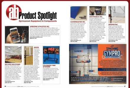
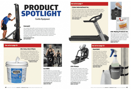
You might have noticed something different about the last issue of Athletic Business when it arrived on your desk. Over the past six months we’ve been working on a rebranding. Everything from the magazine’s cover to the content inside has been given a facelift. “Using some lingo from the industry, think of the rebranded magazine like a rec center that just received a major renovation,” says Ron Reason, a nationally renowned design consultant who advised AB on the redesign. “We’ve made it easier for people to find their way in, find what they’re looking for, keep them engaged while they’re there and keep them coming back.” But as an advertiser, you might be asking yourself, “so what?” How does our rebranded magazine benefit you? We answer that question in today’s blog post. 1. Backed by Data While our staff felt it was time to freshen up the magazine, the most important thing was finding out what our readers thought. So we asked them. The results of our reader survey were very positive. More than 76% of survey respondents said they “never miss an issue” of Athletic Business. But they still had suggestions for ways we could improve. They asked for more visual content so we hired an art director, Nicole Bell, and devoted more resources to illustrations, infographics and photography. We are also adding several new content sections and we’ll outline those in point number three below. We didn’t just make a change just to make it. We did it to better serve our readers and our advertisers. As an advertiser, knowing our readers will be spending more time with the magazine means greater exposure for your message. 2. A Better Vehicle for Your Brand Our magazine is the biggest reflection of our brand. While other brands cut back on their magazine, AB invested in making ours better. “There is so much talk about digital, digital, digital,” says Reason. “But print is still the most important aspect of your brand. AB clearly understands that and committed to creating the best product possible for readers and advertisers.” When you partner with AB, you are aligning yourself with our brand. That’s not something we take lightly. We always strive to present our magazine — and your advertising message — in the best way possible. The clean, fresh look of the rebranded magazine helps us do that better than ever. 3. More Content As mentioned earlier, the rebranding brings an array of new content. This helps us (and our advertisers) build an even stronger connection with our subscribers. Our readers said they wanted more content devoted to leadership and career improvement so we’ve added a “Personal Best” column written by leaders in our industry. They asked for more articles on safety and security so we enlisted the help of the experts at the NCS4 to bring readers more content devoted to that topic. We devoted more space to new product sections so readers are aware of the latest and greatest products on the market. “We knew we didn’t need to make drastic changes, but the additional content we’re now providing will make the magazine even better,” says AB editor Emily Attwood. 4. More Engaging, Easier to Read, Yields Bigger Audience AB has always been known for editorial excellence, but now that editorial content is easier to find, easier to navigate and more inviting than ever. “What sets AB apart is the content we provide our readers,” says Bell who oversees the magazine’s layout. “Keeping that in mind, the information people receive today is very visual. The goal was to find that perfect balance. Inviting readers in with the best information they trust us to provide, and hopefully having them stay for a while with beautiful photographs and graphics.” Making the magazine more engaging means readers will spend more time with it. They will be more likely to share it with their coworkers and colleagues. And this means more value for your advertising. 5. A Better Advertising Landscape
Finally, there are some subtle changes that might go unnoticed if you’re not a design expert. The magazine has more white space and images no longer “bleed” off the page, helping your advertisements stand out. Fonts have been updated. There are more sidebars and visuals throughout the magazine. “What I really love about this redesign is how clean the layout looks,” Bell says. “If a message is being conveyed through an image or through type, a clean layout allows that idea to come through.” We hope you enjoy the rebranding and reap the benefits of an improved advertising landscape. You can see the changes for yourself in our January/February issue which should be arriving soon if it hasn’t already. Don’t receive our magazine? Contact Diane or Michael to be added to our advertiser comp list.
0 Comments
Your comment will be posted after it is approved.
Leave a Reply. |
CONTACT |
|


